Art 1 Final Exam
0 Comments
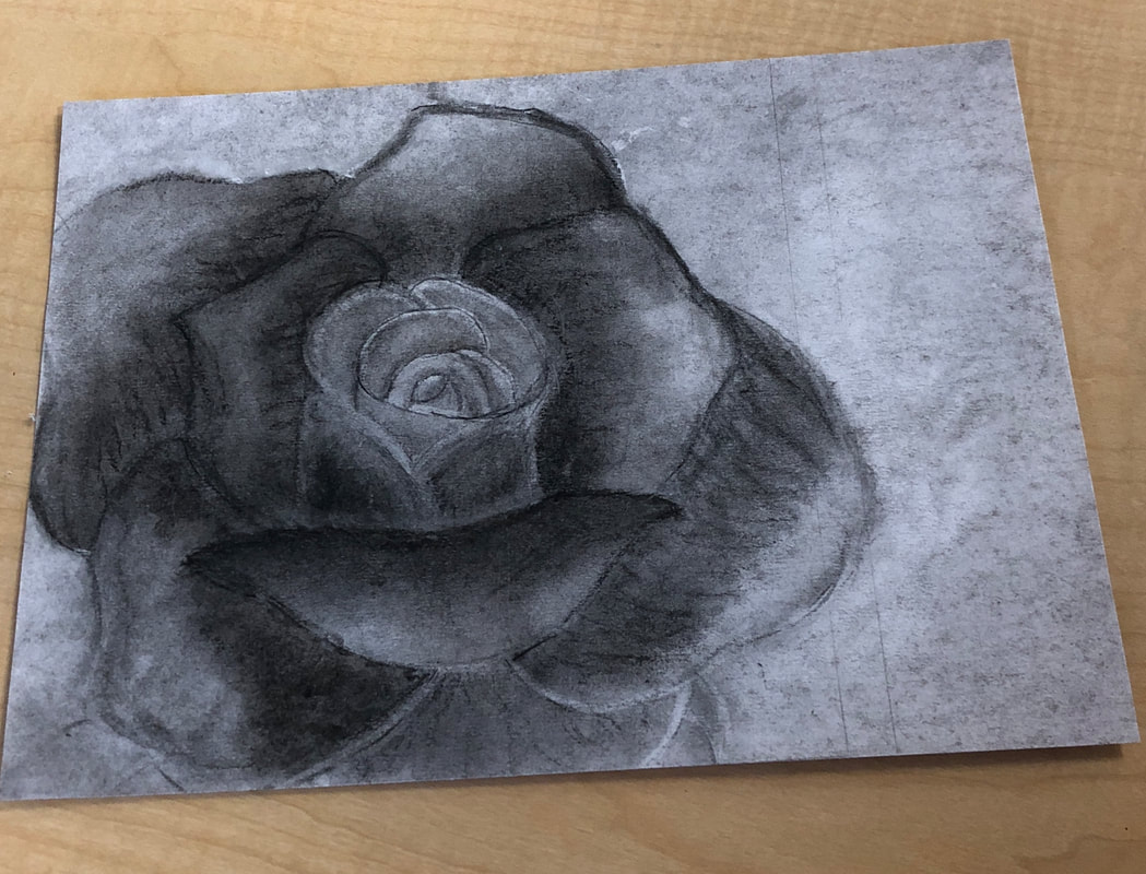
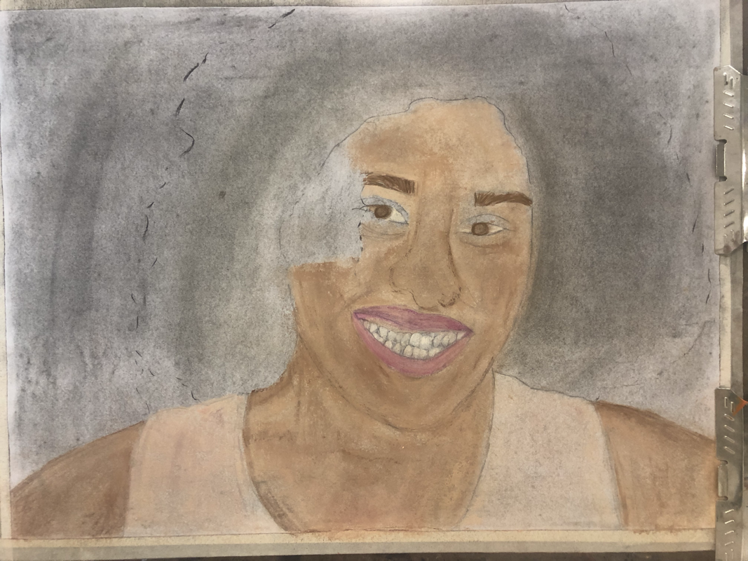
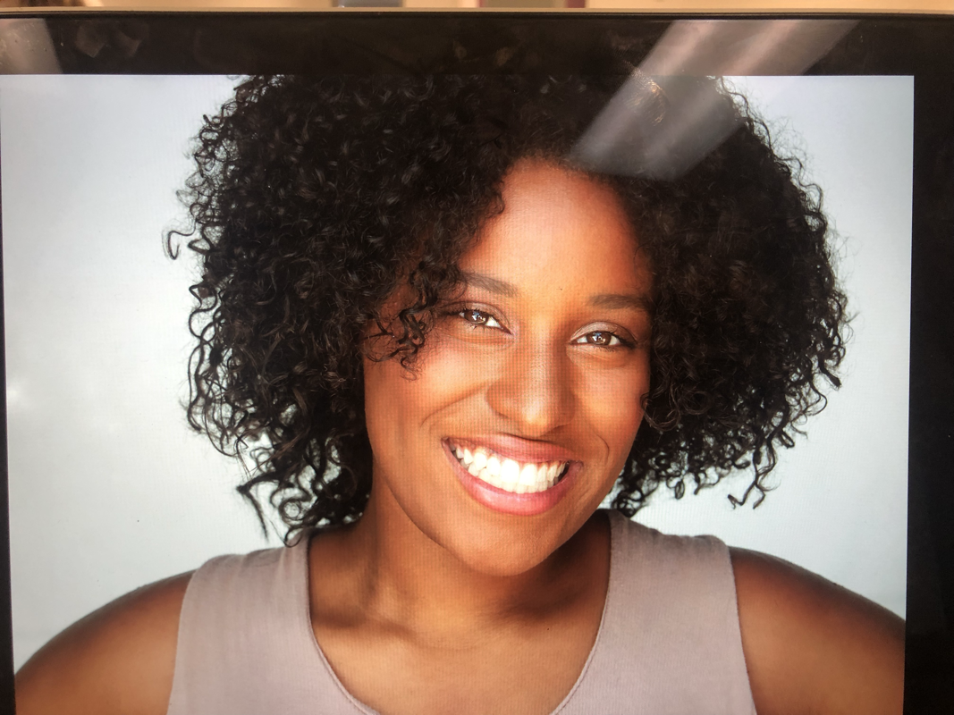
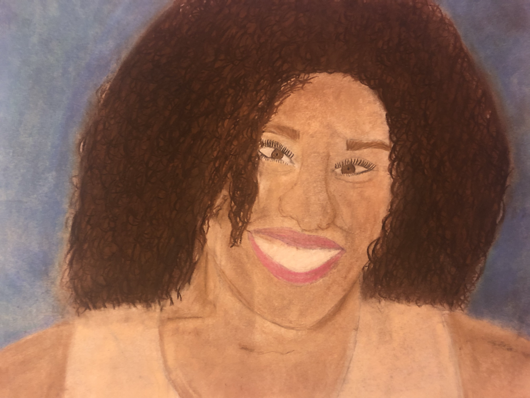
I did my portrait piece on myself. I did my piece in charcoal. I started off by doing the outline. I started at the shoulders because that seemed like the easiest thing to do so I started there. I had to make sure I wasn’t blending it in. By layering the charcoal it blends it. So by the end all I had left to do was the hair and the eyes and the eyes were the hardest to part. The main thing I would change is the hair and the face. The way I did the face I should’ve done that first but the only thing I find successful about it is the blending and the clothing and the shoulders.
The proportions warm up was the most helpful for me because it helps me realize that the face isn’t just a circle with eyes a nose and a mouth. There are certian proportions to it that make it look more realistic. The point that the nose ends at the start of the eyes really surprised me a lot because I used to draw my face however and then wondered why it never turned out right.
page 48-
Creating The Print Plate- A printing plate is the surface on which the desired image is created. In producing a printing plate, the artist makes a mirror image of the final print. Letters and numbers must be made backwards on the plate Inking The Plate- The artist applies in the the plate. This is done with a brayer, a roller with a handle. For a multicolor print, one plate must be made for each color. The ink creates the image on the print. Transferring The Image- The paper or other material is pressed against the inked plate, and the ink is transferred to the new surface. Sometimes this is done by hand. Other times a printing press is used. Usually, more than one print is made from a single plate. Together, all the prints made from the same plate, or set of plates, form an edition. Each print in an edition is signed and numbered by the artist. The printmaker signs the work in the bottom margin and writes the title on each print of an edition as well as the number of each print. the number 10/200 indicates the tenth of 200 prints. Relief Printing- In this method, the artist cuts away the sections of the surface not meant to hold ink. As a result, the image to be printed is raise from the background. page 330- Woodblock- this is making prints by carving images in blocks of wood. Using the technique, artists could produce many inexpensive prints of one image. Utagawa Hiroshige, also known as Andō Hiroshige, was a Japanese ukiyo-e artist, considered the last great master of that tradition. Hiroshige is best known for his horizontal-format landscape series The Fifty-three Stations of the Tōkaidō and for his vertical-format landscape series One Hundred Famous Views of Edo. Step- Step 1- trace the shape of your piece of linoleum onto a page in your sketchbook. Using the ruler, connect the opposite corners of the rectangle to find the center of the shape. Place the point of the compass on that center and draw the largest circle possible within the shape. Select your best design and draw it in the circle. Step 2- trace you finished design onto the tracing paper. Use a piece of carbon paper to transfer the design from the tracing paper to the piece of linoleum. Step 3- using a draw marker to color the lines and shapes on the areas of linoleum that will not be cut away. Step 4- use a bench hook to hold your linoleum safely in place. You have let the linoleum in the shape of a rectangle so that it can be held in place by the bench hook. Do not cut it into a circle until all you linoleum cuts are finished. Use the narrow V-gouge to outline shapes. Always use the cutting tool in an outward motion away from your body. Use wider U- gouges to cut away the negative areas. The pattern of your cuts will show in the final print. Plan the direction of the cuts as carefully as you plan the positive shapes in your design. Finally, use the V-gouges to cut the fine lines on the positive shapes. Step 5- select your paper to make an edition of five prins. Locate your drying place. Squeeze out an inch of ink onto the inking plate. Roll the brayer in both directions until it is loaded with ink. Ink the linoleum. Make five prints. When they are dry, sign each one in pencil at the bottom of the print. Write the title on the left, the number in the center, and your name and date on the right. The number should include the number of the print and the total number of prints in the edition. My most helpful warm up would have to be texture with paint because with that it helped my with my painting because there were so many different textures in my painting. This painting is called "home sweet home". This is a painting of La Playa Grande in the Dominican Republic. The reason I picked this picture is because this is like my second home. My father is Dominican and I used to go 2 or 3 times a year, but now I only go for the summer. This beach really called my when I picked it as my picture because I love going "home" for the summer. The most difficult thing I would have to say is making the palm trees look real and being able to make the shadows so that the trees weren't floating. Even though I was stressing about the palm trees and its shadows they turned out the best parts in my painting. I started off not knowing how to start and didn't wanting to mess up my canvas. But eventually I got the hang of it and finished it off.
1. What warm up was most helpful during this unit and why? I would have to say the sign language warm up and the charcoal warm up was my favorite and helped me the most because it really showed me that paint and pencils and markers aren’t my only resource when it comes to art. 2. Define composition and value. The way in which a whole or mixture is made up. So an example would be the blending. And value is the lights and dark tones or colors. The value halfway between these extremes is called middle gray. Space An element of art by which positive and negative areas are defined or a sense of depth achieved in a work of art. Color An element of art made up of three properties: hue, value, and intensity. 3. Pros and cons of each medium (pen, pencil, charcoal) Pencil~ pros: you can erase if you mess up. Straight solid lines. cons: it indents the paper. Charcoal~ Pros: if you mess up you can use the vine and go over it again and smooth it back out with a paper towel or a blending stick. cons: if you don’t layer it, it will all blend into one big blob. Pen~ pros:it leave a fine smooth finish. The lines don’t have to be neat for it to look good. cons: you can’t erase it if you mess up.
A little bit of all. I used the fur and rock texture in my grass and water and that turned out really good.
Fur~ different colors look better together fabric~ Im not really good at that lol
|